A while back (a number of years ago) I enrolled in two courses with concepts that “dovetailed” when I saw the following graphics. The caveat still holds. One of the courses is “The Future of Storytelling” where in a recent discussion about story versus plot (how each is defined) I was reminded of the Benjamin Disraeli quote where he said there were three type of lies: Lies, damn lies, and statistics. In storytelling, I posited, the plot is similar to plotting in graphing and charting in statistics… the plot is similar to the points that the graph or chart maker chooses in order to depict data… where the points of data that are chosen can tell a very different story than what is really going on (thus, I also posited, how withholding bits of the plot – withholding points of data that tell more – the storyteller can build suspense, misdirection, etc.)
At the time I was also enrolled in a course about design – and how it’s being used in the modern world. Thinking about how design can do PRECISELY the same thing that a storyteller can do, or that a statistician or chart/graph maker can do… just by revealing only the bits of the data, in a particular way.
So these two ideas neatly dovetailed when I saw the following – it is a graphic that appeared on a national news channel:


At first glance, one gets the impression that there’s massively more of what the chart maker is showing on the left than on the right. But… there’s something seriously wrong with this graph.
What is it?
Hmm… let’s see. Well, for starters… let’s look at the SCALE. See how the data on the right is very, very short compared to that on the left?
See how those red boxes (that are the size of the apparent 101.7 million on the right) stack up to OVER 5 times the height of the column on the right, yet claim to depict a difference of 6.9 million? What is the baseline for this data? hmm. From what I see, it doesn’t start at zero, which is implied… it starts, oh, maybe at roughly 100 million. Not at zero at all.
So what appears to be a HUGE difference, in reality is not.
Let’s look at a chart with a baseline of zero. Just plugging in the two numbers and creating a simple chart…here’s how it would look if the baseline WAS zero:
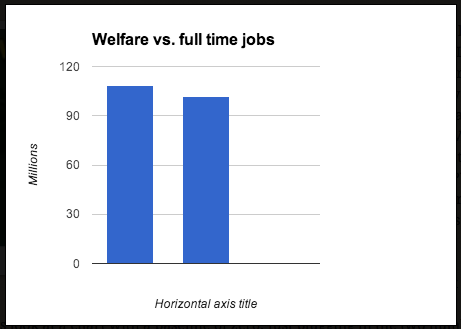
Quite a difference, for starters. But that’s not the whole story.
Now let’s look at what the plot points are showing… are they comparing adults on welfare to adult workers? Are they comparing families on welfare to families working and not receiving assistance?… what the heck ARE they comparing?
To look at that, we have to see the actual data that was used to make the chart.
(this is from the U.S. Census Bureau, Survey of Income and Program Participation, Waves 10 and 11, 2008 Panel, October-December 2011.)
The data comprising the 108.6 million is defined as all people…. (who) … Received benefits from one or more means-tested programs. It:
(1) Includes free or reduced-price lunch or breakfast, energy assistance, state-administered supplemental security income, and veterans’ pensions not shown separately.
(2) Includes anyone residing in a household in which one or more people received benefits from a means-tested program.
Which means that the biggest data point, 108.6 million, is not a number reflecting adults who are not working and are receiving welfare. It’s recipients of any of the mentioned “means-tested programs.” And that’s not everyone the data point includes… it’s not only the recipients of those programs, it’s also their families… infants, kids, spouses, grandparents, cousins, roommates, etc. … It’s anybody residing in their household.
Let’s see if the other category, People working full-time jobs, uses a similar sampling of data:
This data also comes from the Census bureau. the 101.7 million figure is from the table counting Private Wage and Salary Workers, Both Sexes, All Races, those who worked full-time, Year-Round.
(which incidentally does not come with footnotes saying that it includes households or anybody else at all.)
Since it doesn’t include part-time workers (SOME of whom may receive assistance, but certainly not all) and it doesn’t include the families and others living with those full-time workers… this chart is definitely not using data sets that are remotely identical. Except that they depict numbers of people… just not COMPARABLE TYPES of numbers of people.
So what message is it attempting to send? What story is the creator of the chart trying to tell? What is the design of the truncated baseline intended to accomplish?
(I think I know but I’ll let the reader make their own conclusion. But for sure, the intent is not to present a clean data set that shows just what two sets from identical data sources indicate. That is beyond doubt no matter what conclusion you make about the message behind the chart.)
Does this chart qualify as one of Disraeli’s third types of lies? I think so.
Enough of that for now….
—- But wait… here are more possibly useful bits of data that never made the chart —
Interestingly enough, when you dig deeper into the data sets, you find tables showing the “total work experience” of male and female workers at the time the data was pulled. Let’s look at that:
Hmm. The total number of male Private Wage and Salary Workers (part or full time) in the current population survey… 119.9 million.
How about the women? There appear to be 127.7 million Private Wage and Salary Workers in this table.
That comes to roughly 246 million men and women working.
If you deduct the just under 55 million unpaid family workers (ages 15 years and over) that still leaves 194 million folks who are working part or full time.
Hmm. Hmm, hmm and hmm.
Note: I got the “aha” moment about design/storytelling and the comparisons when I saw a similar dissection of the chart shown above… so I thought I’d do some looking into it and see if their conclusions were correct. The conclusions of the folks who questioned these charts are borne out by the data. It was fun to run over them myself and make sure that those folks weren’t ALSO lying.
